
KORE Software
Re-imagine Delivery



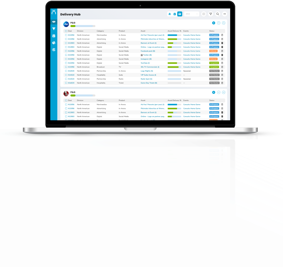

Our users are struggling. To finish a simple task, they need to switch tools, sync data, muddle through pages, click dozens of times, and battle with validations.

Hard Adoption & Time-to-value

Fragmented Workflows

Operational Delays & Frictions

Lack of Flexibility

Lack of Intelligence

Outdated UI/UX
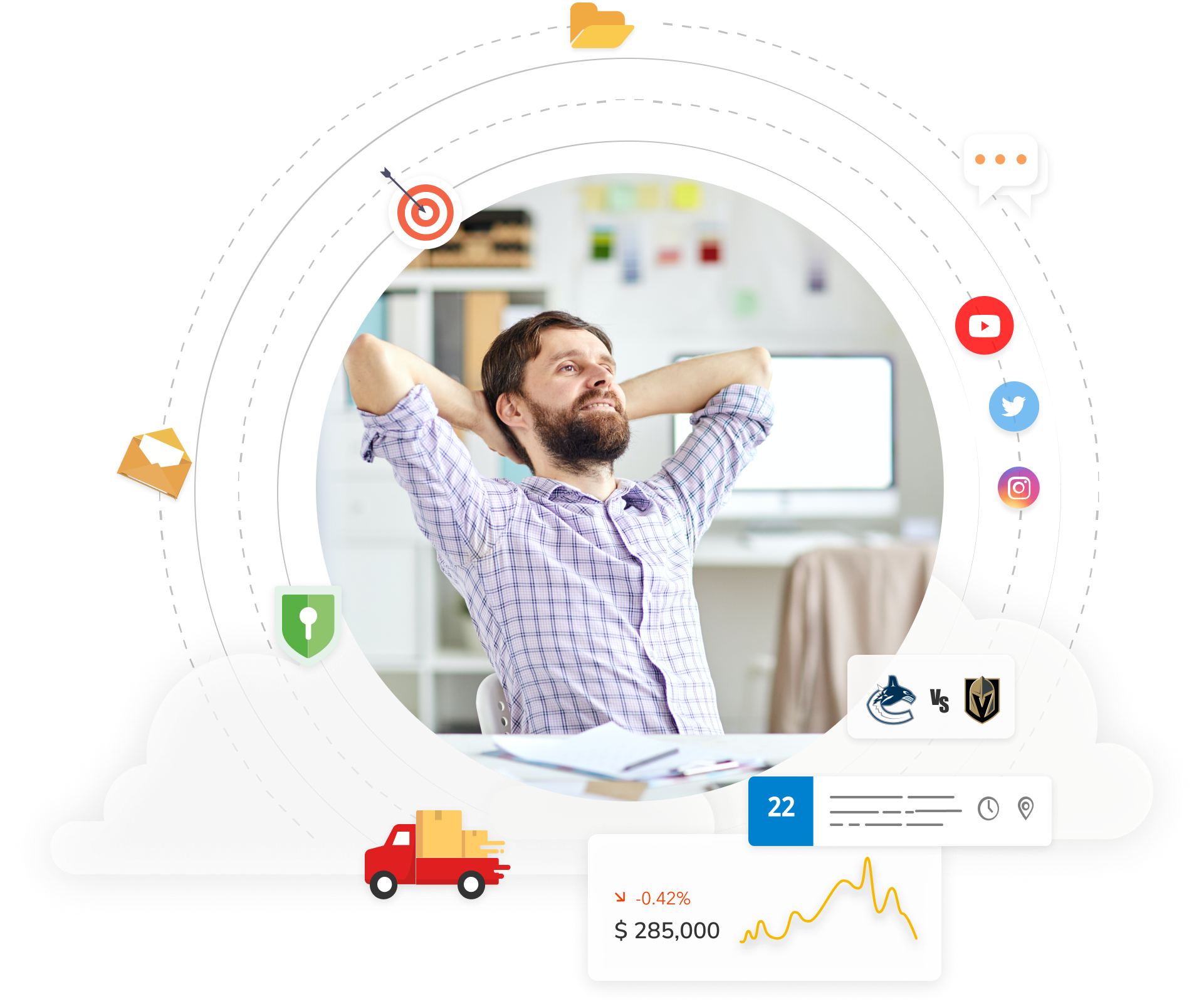
Make users happy. We’ll redesign the entire experience from scratch with extensive user research and modern UI.

Unified Experience

Design Around Real Workflows

Streamline Common Tasks

Org & User Customization

Smart Operation & Automation

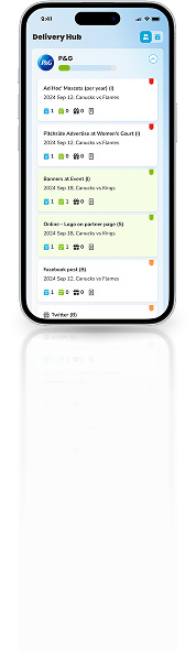
Mobile Friendly

Visually Pleasing

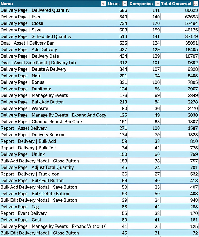
Delivered Quantity
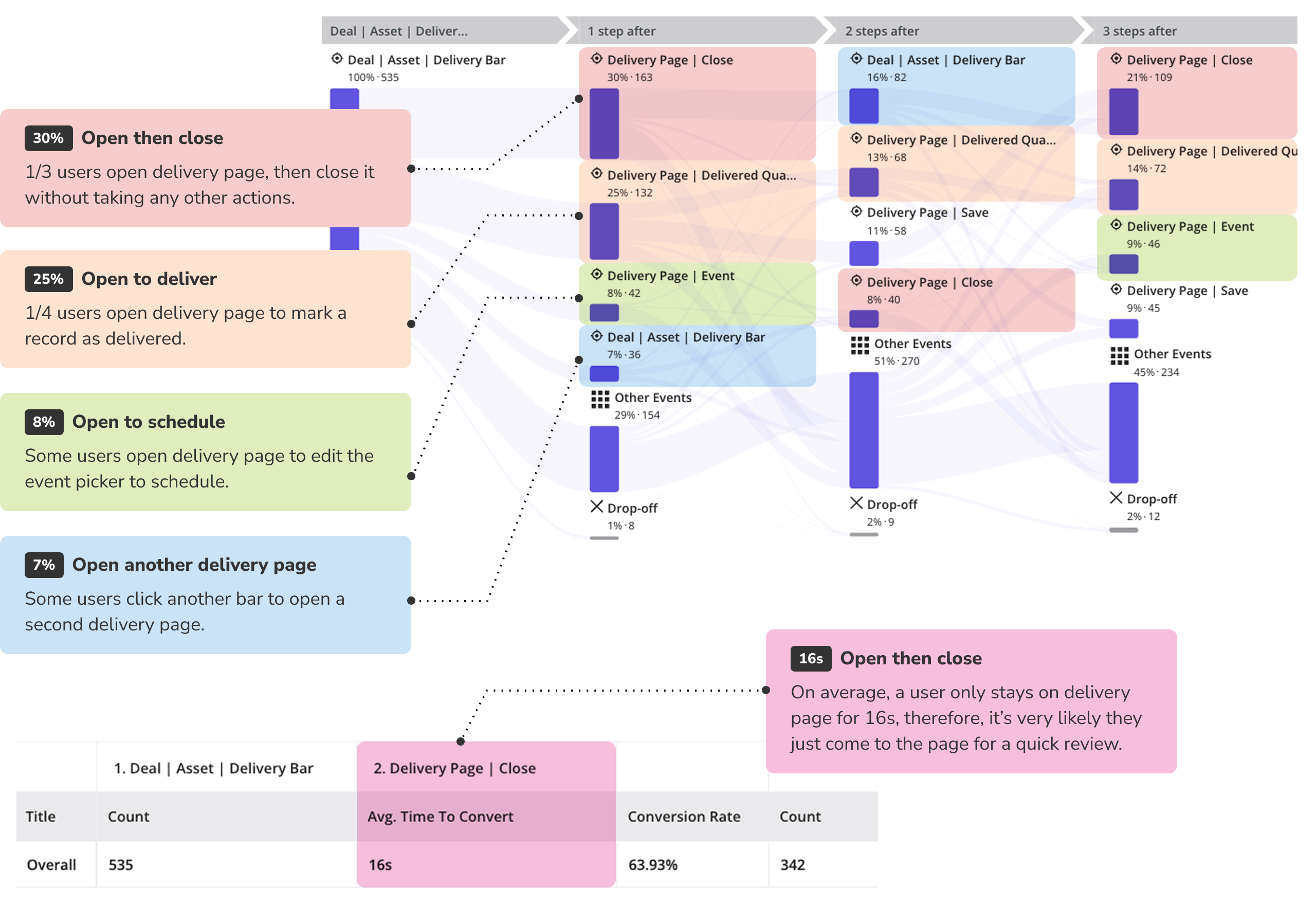
Users come to delivery page primarily to mark a record as ‘delivered’
Event
Users need to add event one by one, plus search for a specific event every time. 63,693 clicks yields 63,693 searching.
Close & Save
Close outnumbers Save by 10,000+. So many users close the page without saving.
Scheduled Quantity
Users need to manually update the scheduled quantity a lot.
Delivery Bar
Delivery bar is the entry point. Managing 5 assets means clicking 5 delivery bars separately and opening 5 delivery pages.
Add Delivery
Users manually add deliveries a lot.
1. Too many clicks, layers, & functions
2. Core user flows: review, deliver, schedule.

- Faster inline editing.
- Support over-deliver.
- Bulk mark as delivered.
There are waaaaay too many clicks. we need to streamline common tasks.

Delivery is silo-ed by each asset, hard to manage delivery across multiple assets, and harder across multiple deals.
👉 Surface data to Account and Event level

There are way too many functions, but only a handful are useful.
Many components have very low usage, but still battle for the limited space.

There are too many functions, but they don’t serve the user flows well.
Users open delivery page for 2 main reasons: review data & mark as delivered.
To deliver an asset, e.g. after a game day on Sept 18, Sandy wants to mark 5 assets as delivered for P&G and KFC respectively.
She needs to muddle through multiple pages back and forth, and click dozens of times.
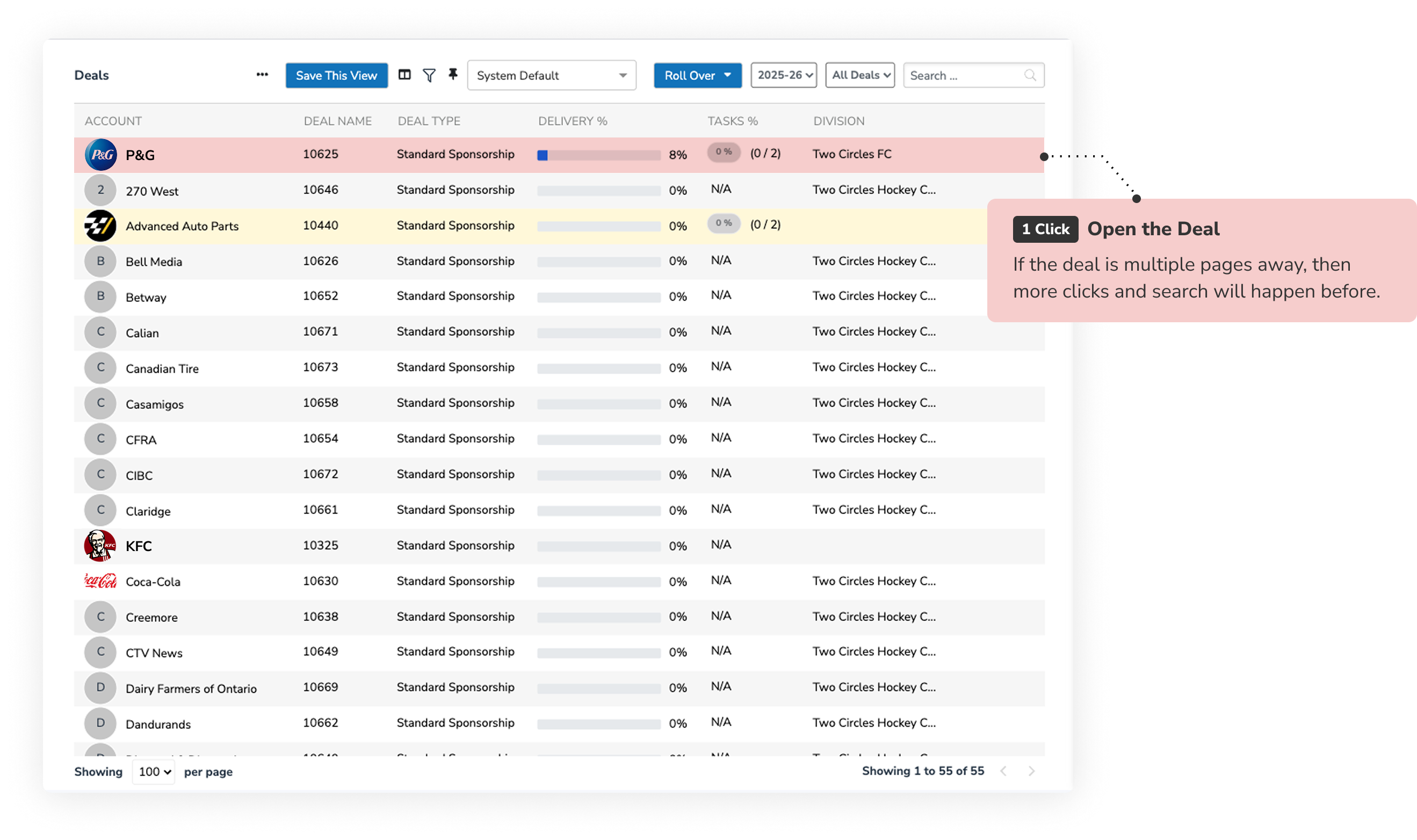


To deliver an asset, 5 clicks minimum
To deliver 5 assets of P&G, 25 clicks minimum.
Then, to go KFC:
- [1 click] get out of P&G deal
- [1 click] get into KFC deal
- Then repeat the same process.
Same use case, e.g. after a game day on Sept 18, Sandy wants to mark 5 assets as delivered for P&G and KFC respectively.
This time, her experience is much easier: 1 page only, 10 clicks.

To deliver an asset, just 1 click.
To deliver 5 assets of P&G, only 5 clicks.
Find another 5 rows in KFC. 5 more clicks.
In total: 10-12 clicks, 1 page only.
The workload is reduced by 80%.
We use the traffic from 8 key components to find out clients who have balanced usage. This means they use delivery features extensively and can be good subjects for interview.

Once identifying a right org, e.g. LA Chargers, we can drill in and look at its users activities to find out who is the frequent user, e.g. Jared Berenstein.
Then, we can dig deeper to see the user’s profile. In this case, Jared used delivery features heavily, so he would be an ideal interviewee.
We interviewed 12 clients. 4 of them even took the second round.
Afterward, we reviewed each transcript and summarized their common grounds, e.g.
'Schedule' has been the most complex experience. In the past, we just threw an all-inclusive page, and users figure out the rest, leading to hard adoption and frustrating UI/UX.
Even a simple use case requires multiple pages and dozons of clicks. For example, I wanna schedule ‘VIP Suite’ for this season. We sold it to P&G for 10 events, 2 per event.
During the interviews, we worked with clients to re-define the new schedule processes.

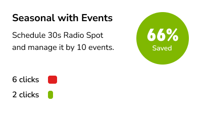
Same use case: I wanna schedule ‘VIP Suite’ for this season. We sold it to P&G for 10 events, 2 per event.
In total: 10 clicks, 1 page only.
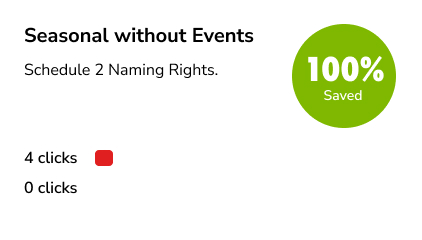
The workload is reduced by 75%.

We redesigned the entire schedule process by breaking it down to 6 (and only-6) user flows.





A mobile-friendly version that enables on-ground users to update deliveries in real time, upload proofs, and sync delivery info with desktop application.


The mobile application is a downsized version solely for: executing pre-scheduled deliveries and uploading proofs relevant to them one by one.
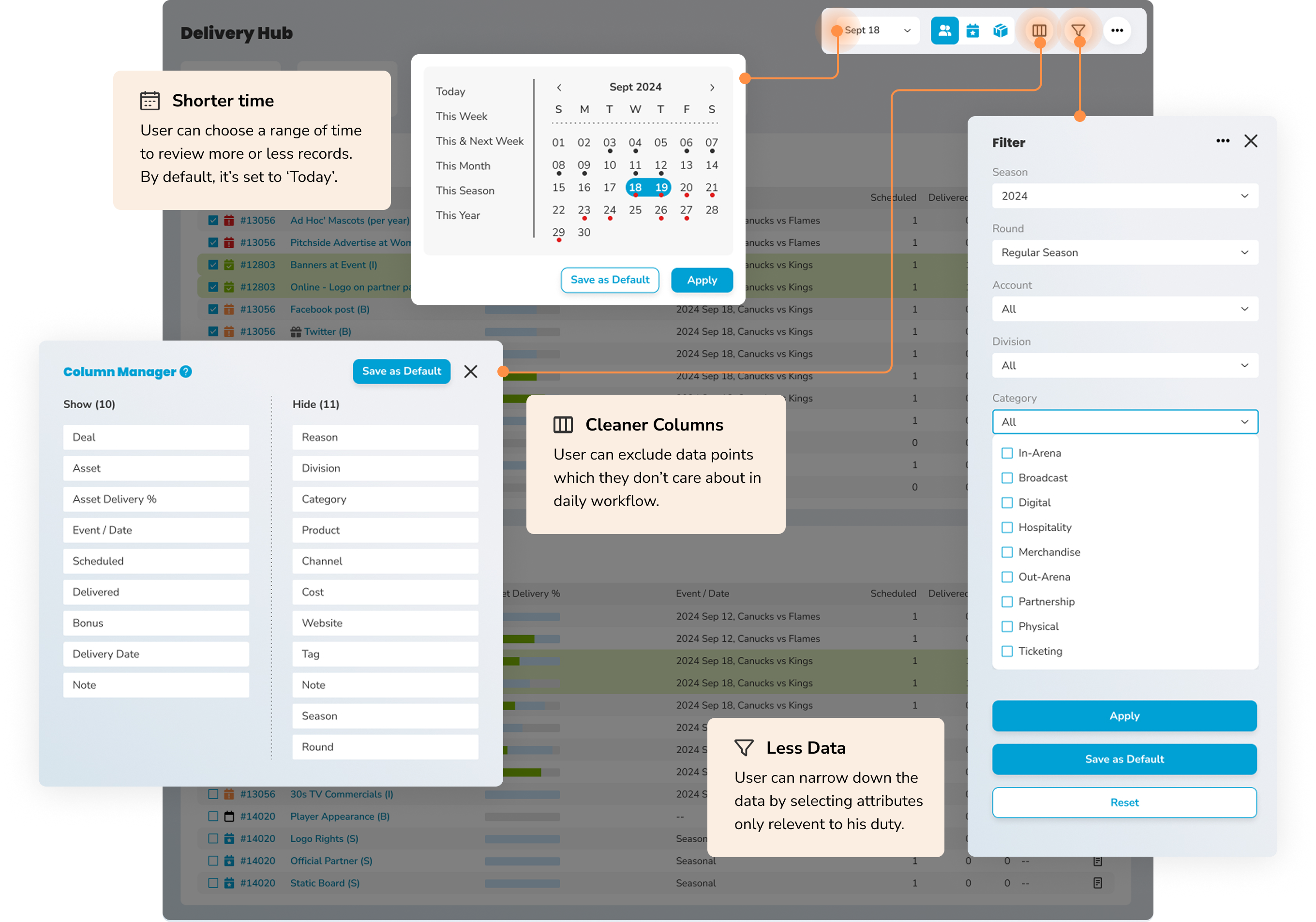
Since we have over 160 teams using this application, and each business has some different needs, we provide a few widgets in the new design to help 'personalize'.
With the 'triple kill' of time-picker, filter, and column manager, they can narrow down the volumn of data and customize the view to best fit their daily workflow.

Looking at the daata from all external users in 2025 again (509 active users across 164 orgs). With new design in place, half of components can be greyed out, namely decomissioned. That saves:
Clicks saved in a year
Clicks saved per workday
Clicks saved per user
